明治時代の中国陶磁器 - 華榮堂
清末から民国初期にかけて欧米の富裕層に輸出された「華榮堂」の作品を先日入手致しましたので、今日は少し真面目にご紹介したいと思います。明治時代の陶磁器ではありますが、ご紹介する作品は同時代の清朝末期から民国設立期の中国製です。
さて、清末の陶磁器と言えば、康熙・雍正・乾隆などの清朝歴代皇帝に負けまいと、1915年に洪憲帝を名乗った北洋軍閥総帥の袁世凱が設立した準官窯としての「居仁堂」が有名です。しかし、華榮堂は同時代の陶磁器ではあるものの、その出自が居仁堂とはかなり異なります。
清代後期の十九世紀後半以降、景徳鎮を中心とした官窯体制は宮廷需要の急速な縮小とともに、多くの優秀な画工や技術者が職を失いました。こうした人々の一部は、開港以降急速に発展した通商都市・広東(広州)へと流入し、従来の民窯とは一線を画す高度な絵付け技術と装飾感覚を、輸出磁器制作の現場にもたらしました。
同時期の広東には、欧米の商社やバイヤーが常駐し、西洋市場の嗜好に即した器形や意匠、色彩設計に至るまで、具体的な指示や要望が出されていました。
ほぼ同時期の日本で起きていたこととまさしく同様のことが中国窯業界でも起きていたということになります。周知の通り、1898年の明治維新に伴って、鍋島・薩摩・大聖寺などの藩窯が崩壊し、陶工や画工の地域間流動が進みました。また、開国と折からのジャポニスムブームによって欧米向け輸出需要も一気に高まりました。更に、ワグネルなどの学者による作陶の技術指導。欧米商社による欧米向け意匠の奨励。
これと同じ社会現象が辛亥革命直後の中国でも起きていたということになります。
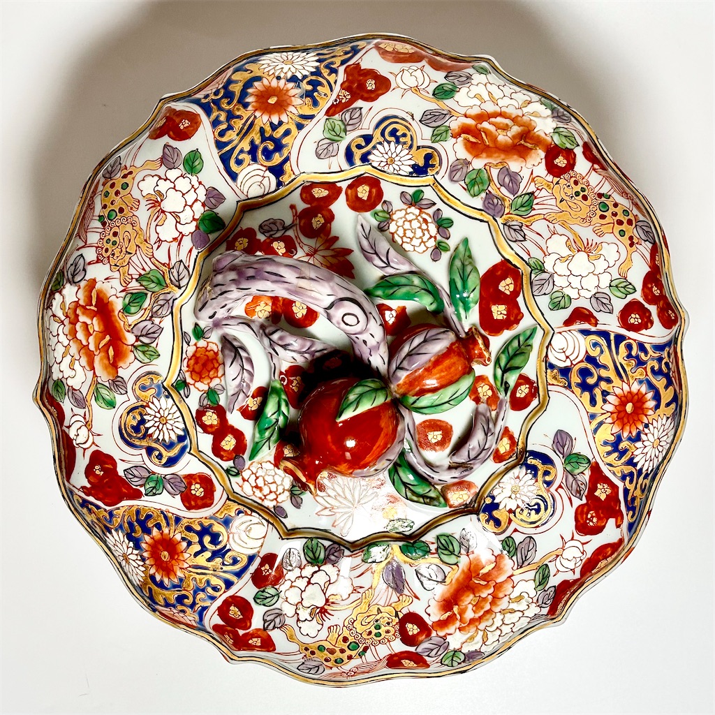
さて、ご紹介する作品を見てみると、外面全体に、広彩(カントン・エナメル)による密度の高い装飾が施されています。牡丹や草花文を中心とする吉祥花卉文は、輪郭線に自然な強弱を伴う筆致で描かれ、赤彩を基調としながらも発色は過度に鮮烈ではなく、緑・紫・藍などの彩色はやや沈みを帯びています。これは、官窯系画工に由来する描写力と色彩感覚が、輸出磁器という新たな文脈の中で昇華された結果であり、清末から民国初期に特有の成熟した色階調と装飾感覚をよく示しています。文様の一部には金彩が用いられていますが、その扱いはあくまで補助的で、装飾全体を支配することなく、時代相応の節度を保っている点が注目されます。
本作の装飾構成には、中国的要素のみならず、日本および欧州の磁器意匠が重層的に参照されている点が看取されます。文様を面として区切り、余白を抑えて装飾を充填する構成や、赤彩と金彩を基調とする華やかな装飾感覚は、江戸後期から明治期にかけて欧州市場で高く評価された伊万里金襴手輸出磁器を想起させるものです。これは偶然の類似ではなく、欧州市場において伊万里磁器が形成した「高級磁器の記憶」を前提に、広東の画工と商社がそれを再解釈し、意図的に取り込んだ結果と考えられます。
一方、蓋頂に配された石榴摘みの造形は、単なる中国的摘みの延長ではなく、欧州官窯磁器に見られる蓋物の造形思想と強く共鳴しています。蓋の中心軸を強調し、立体としての存在感を際立たせるこの設計は、マイセンやセーヴルなど、十八~十九世紀の欧州王侯磁器における視覚的演出を想起させるものであり、本作が西洋の家具や室内空間に置かれることを強く意識して制作されたことを示しています。
すなわち本作は、中国広東を制作基盤としながら、中国の吉祥意匠、日本の伊万里金襴手輸出様式、そして欧州官窯磁器の造形思想という三つの視覚言語が交差する地点に成立した作品と位置づけることができます。
内面および高台内は、わずかに青灰味を帯びた柔らかな白釉で覆われており、口縁部や高台周囲には、長期間の保管・使用に伴う自然な汚れや摩耗による古色が認められます。
底部中央には、朱書の方形印にて「華榮堂製」の四字款が記されています。字画や枠線にはわずかな揺れが見られ、朱の発色も沈着しており、後代の名義借りや現代的模倣とは明確に一線を画します。華栄堂は、清末から民国初期にかけて広東で活動した輸出専門工房の堂号の一つであり、官窯崩壊後に流入した高度な技術者層と、西洋商業資本の要請とが交差する地点に成立した工房として位置づけることができます。
本作は、器形・装飾意匠・彩色・立体造形・底款・使用痕のすべてが高い次元で整合しており、清末から民国初期に造られた華栄堂製輸出磁器の中でも極めて上手の作例といえます。さらに、中国・日本・欧州という三文化の要素が意識的に統合されている点において、単なる広彩磁器の枠を超え、近代における国際的装飾芸術の一側面を物語る資料的価値を備えていると言って良いでしょう。これからもっと積極的に研究評価されるべき陶磁器であると考えます。
尚、1970年代にも華榮堂の銘を持つ作品が広東で造られていましたが、これは清末の華榮堂とは全く関係のない陶磁器ですので、ご注意下さい。
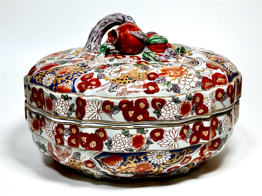
H24cm. D36cm


I recently acquired a work by Kaeidō (Huáróngtáng), produced from the late Qing dynasty to the early Republican period and exported to wealthy Western collectors. Today, I would like to introduce this piece in a more scholarly manner. Although it belongs chronologically to the Meiji era, the work discussed here is a Chinese production dating from the final years of the Qing dynasty through the founding period of the Republic of China.
When discussing late Qing ceramics, one inevitably recalls Jurentang, the semi-official kiln established by Yuan Shikai—supreme leader of the Beiyang warlords—who proclaimed himself the Hongxian Emperor in 1915, seeking to rival the great Qing emperors such as Kangxi, Yongzheng, and Qianlong. While Kaeidō belongs to the same general period, its origins differ markedly from those of Jurentang.
From the latter half of the nineteenth century onward, the imperial kiln system centered on Jingdezhen declined rapidly as court demand contracted. As a result, many highly skilled painters and technicians lost their positions. Some of these individuals migrated to Guangzhou (Canton), a treaty port that had grown rapidly following its opening to international trade. There, they introduced sophisticated painting techniques and refined decorative sensibilities—distinct from those of traditional folk kilns—into the production of export porcelain.
At the same time, Western trading firms and buyers were permanently based in Guangzhou, issuing concrete instructions regarding vessel forms, decorative motifs, and color schemes tailored to Western tastes.
In effect, developments strikingly similar to those occurring contemporaneously in Japan were also taking place within the Chinese ceramic industry. As is well known, following the Meiji Restoration of 1868, domain kilns such as Nabeshima, Satsuma, and Daishōji collapsed, leading to increased regional mobility among potters and painters. With Japan’s opening to the world and the rise of Japonisme, demand for export wares surged, accompanied by technical instruction from scholars such as Wagner and the active encouragement of Western-oriented designs by European trading houses. An essentially identical social and industrial phenomenon unfolded in China in the immediate aftermath of the Xinhai Revolution.
Turning now to the present work, the exterior is entirely covered with dense decoration executed in Canton enamel (Guangcai). Auspicious floral motifs—centered on peonies and various flowering plants—are rendered with brushwork exhibiting natural modulation in line weight. Although red enamel predominates, its tonality is restrained rather than excessively vivid, while greens, purples, and blues appear subtly subdued. This reflects the painterly discipline and color sensibility inherited from court-kiln traditions, elevated within the new context of export porcelain. Gold is employed sparingly and subordinately, never overwhelming the overall composition, demonstrating a sense of restraint appropriate to the period.
The decorative structure of this piece reveals a layered engagement not only with Chinese visual traditions, but also with Japanese and European porcelain design. The division of the surface into decorative fields with minimal negative space, along with the opulent use of red and gold, strongly recalls Imari kinrande export porcelains that were highly prized in European markets from the late Edo through Meiji periods. This resemblance is not coincidental: rather, it reflects a deliberate re-interpretation of the “memory of luxury porcelain” established by Imari wares in Europe, consciously adopted by Cantonese painters and Western merchants alike.
At the same time, the pomegranate-shaped finial atop the lid is not merely an extension of traditional Chinese knop forms. Instead, it resonates strongly with the formal concepts of lidded vessels produced by European royal manufactories. By emphasizing the vertical axis and sculptural presence of the lid, this design recalls the visual language of eighteenth- and nineteenth-century European court porcelains such as those of Meissen and Sèvres, clearly indicating that the piece was conceived for placement within Western interiors and furniture settings.
Thus, this work may be positioned at the intersection of three visual languages: Chinese auspicious iconography, Japanese Imari kinrande export style, and European court-porcelain concepts of form and display—all converging within a production base in Guangdong.
The interior and the recessed foot are covered with a soft white glaze tinged with a slight bluish-gray tone. Along the rim and around the foot, natural discoloration and wear resulting from long-term storage and use can be observed, lending an authentic patina.
At the center of the base appears a four-character mark, “華榮堂製” (Made by Kaeidō), written in red within a square seal. The brushwork and frame lines show slight irregularities, and the red pigment has mellowed with age—features that clearly distinguish it from later name-borrowings or modern imitations. Kaeidō was one of several export-oriented workshops active in Guangdong from the late Qing through the early Republican period, emerging at the intersection of displaced court-kiln craftsmen and Western commercial capital.
In this example, vessel form, decorative design, coloration, sculptural modeling, base mark, and traces of use are all coherently aligned at a high level. It can be regarded as an exceptionally fine specimen among Kaeidō export porcelains of the late Qing to early Republican era. Moreover, through its conscious integration of Chinese, Japanese, and European elements, it transcends the conventional category of Canton enamel ware and possesses documentary value as a testament to international decorative art in the modern period. It is a body of work that deserves far more active scholarly evaluation.
It should be noted that objects bearing the Kaeidō name were also produced in Guangdong during the 1970s; however, these have no connection whatsoever to the original late Qing Kaeidō workshop, and care should be taken not to confuse the two.
天然と野生 The Natural and the Wild
久しぶりの記事なのに、またいきなり明治陶磁器とは関係のない話題から始めてしまい恐縮なのですが、前から気になっていたことがあります。それは、野生と天然の違いに就いてです。
日本では、お父さんが海釣りに行って、釣ってきた大きな黒鯛などを天然の黒鯛と言います。「やはり天然物は養殖物と味が違うな」などと言います。
一方、もしお父さんが山に狩猟に出かけてイノシシなどを仕留めてくると、これは野生のイノシシと言います。
それぞれ、野生の黒鯛とか天然のイノシシとは言わないわけです。
「そりゃ、当たり前だろう」と言われそうですが、さて、この違いはどこから来るのでしょうか。因みに、天然の鯛をAIで英語に翻訳させると、Wild sea breamと答えます。
はて、今度は、Wild sea breamを同じAIで日本語に翻訳させると天然の鯛と答えます。
しかし、wild単独の訳語は野生であり、天然ではありません。
Natural resourcesという言葉があります。天然資源という意味です。つまり、天然=資源という関係が成り立っているように思います。鉱物資源はmineral resourcesです。
つまり、日本語では、「天然」といった時点で、そこには対象の意志や生命といった意味が認められないのではないかと思います。
従って、天然の鯛とは、資源としての鯛であって、そこには海原を泳ぐ鯛の人権ならぬ魚権は認められていないことになります。
昔、「野生のエルザ」という野生ライオンを題材にした映画がありましたが、「天然のエルザ」とはいわないわけです。ただ、我々の近くにいる、ちょっと間の抜けた奴などは。「あいつは天然だ」と呼ばれることはありますが、「あいつは野生だ」とは言われません。
やはりここでも「天然」にはどこか意思の入らない自然発生的な意味合いが含まれるようです。
それでは、強い意思を持って、豊富な知識を駆使して働く労働者などは、間違っても天然と呼ばれることはないのでしょうか。実は、そうではなさそうです。
私の職場の周りなどでは、頻繁に技術者たちが「ああ、リソースが足りない。納期に間に合わない」などと嘆息をついています。ここで言う、リソースとは人材のことです。
しかし、リソースの本来の意味は天然資源のことです。ということは、会社やビジネスの世界では、労働者は天然資源と同じものとみなされていることになります。産業資本主義全盛期のマルクスの時代ならまだしも、ポスト産業資本主義の時代とよばれている現在でも、リソースという言葉が使われている、しかも、労働者自身が自らをリソースと呼んでいることには違和感があります。皆さんは如何でしょうか。
申し訳ありません。いつものように話が飛躍してしまいました。
以前、このブログでも明治陶磁器の画題としての鯉や龍、そして、鯉が龍に変身する登龍門の話などを書いたことがあります。あれなどは、それまでただの天然資源と看做されていた鯉が龍と言う強い意思を持った野生の生物に変身したという意味で、単なる変身譚以上の意味合いを含むものだったように思われます。ただ、すべての鯉を解放して龍にするというような革命的な意味合いはそこにはなく、一匹の鯉が精進をして、龍に出世するということですから、あくまでも階級間移動を果たすだけの話であり、うっかりすると、古いアメリカ映画「陽のあたる場所」(原作:「アメリカの悲劇」)のような結末になりかねませんから、油断禁物です。
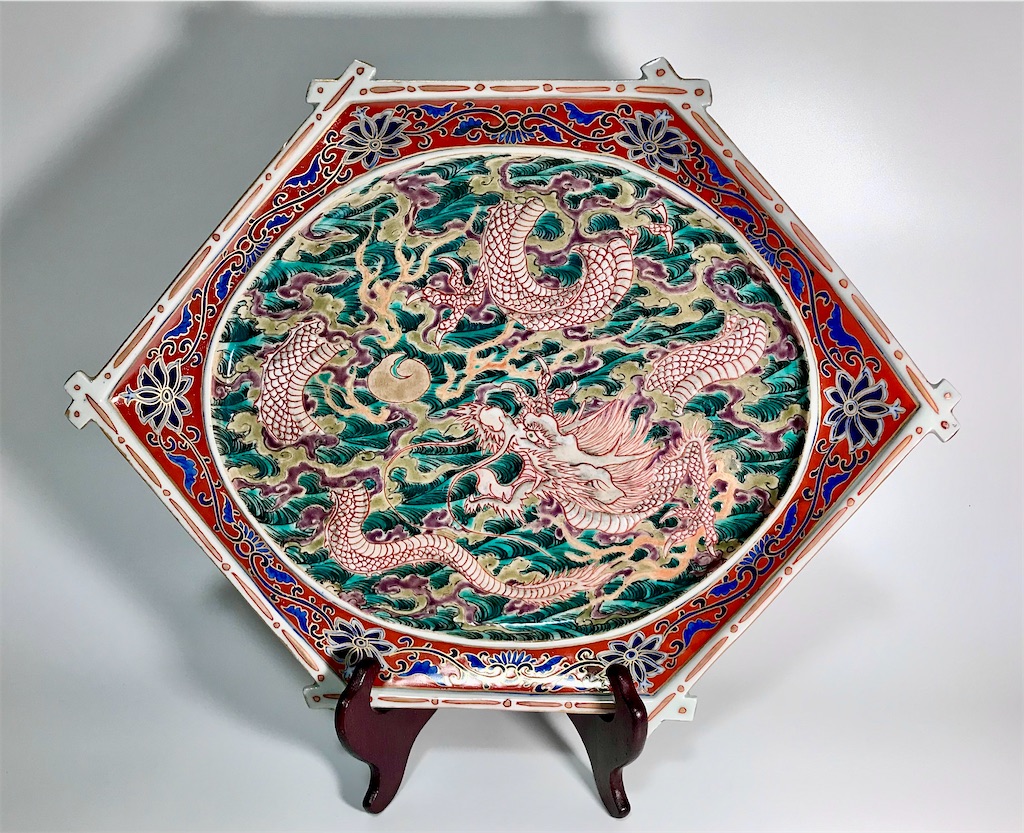
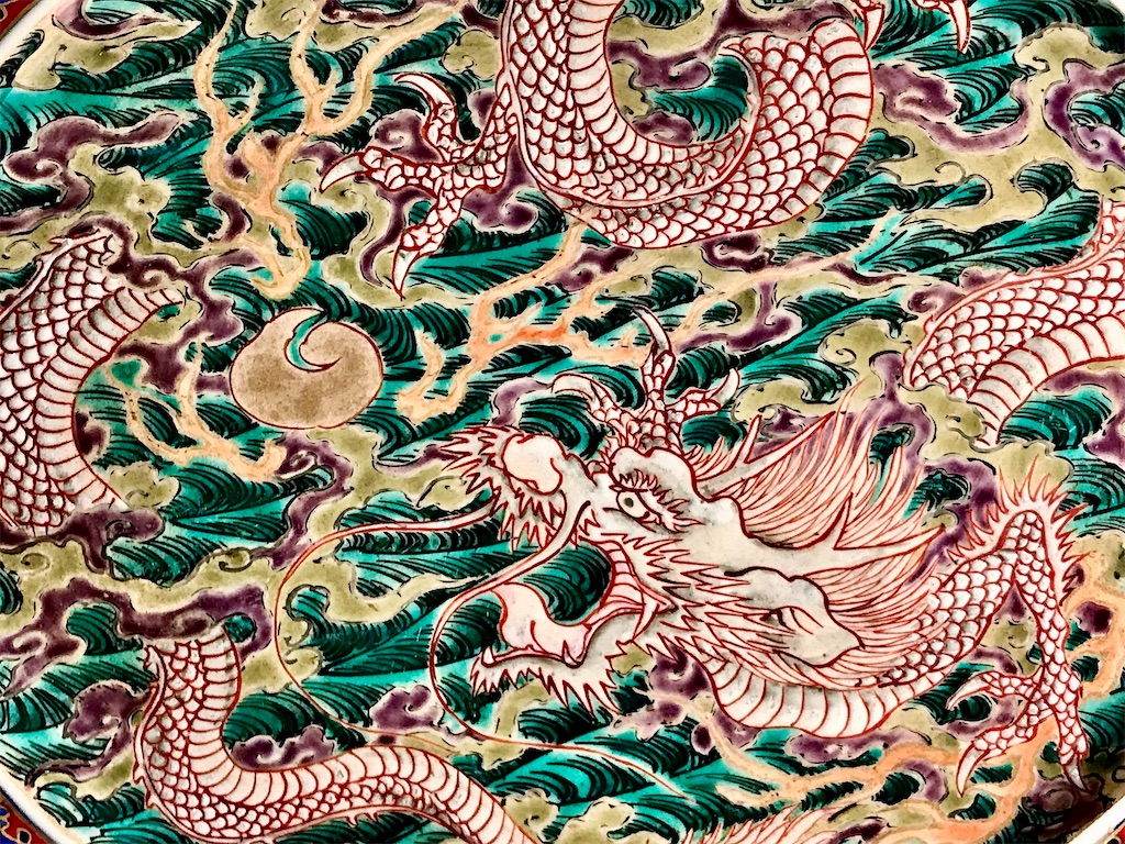
さて、今日、私のコレクションからご紹介するのは、明治初期に創立されたばかりの香蘭社が製作した龍を主題とした六角皿です。こちらの龍は如意宝珠を見つめる姿で描かれ、天然や野生を超越した神獣と呼ぶにふさわしい風格です。ただ、この後、大日本帝国が如意宝珠で全ての望みをかなえようとして、果たせなかったのは周知の通りですから、そこは日本の悲劇と呼べそうです。
Although it has been some time since my last post, I must begin once again with a topic that strays a little from Meiji ceramics. I hope you will forgive the detour. There is something that has long puzzled me: the difference between wild and natural.
In Japan, when a father returns from sea fishing with a fine black sea bream, he proudly calls it a tennen no kuro-dai—a “natural black sea bream.” Someone will say, “Ah, the taste of a natural fish is nothing like the farmed kind.”
Yet when the same father goes hunting in the mountains and brings home a wild boar, we call it a yasei no inoshishi—a “wild boar.” No one would say tennen no inoshishi, nor yasei no kuro-dai.
It seems obvious enough—but where does this difference actually come from?
If one asks AI to translate tennen no tai into English, it produces wild sea bream. And if one translates that back into Japanese, the phrase once again becomes tennen no tai. Yet wild on its own means yasei (wild), not tennen (natural).
Consider the expression natural resources—tennen shigen in Japanese. Here, tennen implies something given, something extracted and used, like minerals or oil. It denotes what exists without will or consciousness. The English wild, on the other hand, carries an echo of freedom and vitality.
In that light, a tennen no tai—a “natural sea bream”—is almost a resource rather than a creature: a product of the sea, not a being of the sea. No one speaks of the fish’s “rights,” just as one would not speak of the rights of coal or copper.
There was once a film called Born Free, about Elsa, a lioness raised and released into the wild. The Japanese title used yasei, not tennen. We would never call her tennen no Elsa. Yet, curiously, in everyday speech we do call certain people tennen: those who act without calculation, whose minds wander somewhere untamed by convention. “He’s such a tennen,” we say—but never, “He’s wild.”
Again, tennen seems to describe what arises naturally, without intent or will—a kind of innocent spontaneity.
But can a person who works with strong will and deep knowledge never be called tennen? In the office, I often hear engineers lament, “We don’t have enough resources—we’ll never meet the deadline.” By resources, they mean people. Yet resource originally meant natural resource.
This suggests that, in the world of business, workers are still regarded much like oil, iron, or timber—assets to be consumed. It feels strange that even in our so-called post-industrial age, the term human resources remains unchallenged—and stranger still that workers themselves use it. Perhaps Marx would have nodded knowingly.
Forgive me; as usual, my thoughts have wandered far from ceramics.
I once wrote about the motifs of carp and dragons in Meiji porcelain, and about the ancient legend of the tōryūmon, in which a carp ascends the waterfall and transforms into a dragon. Seen in this light, it is not merely a tale of metamorphosis, but of awakening: the carp, once a mere natural resource, acquires will, power, and spirit—it becomes wild. Yet this is not a revolution in which all carp are freed to become dragons. It is the story of a single fish rising through effort, achieving mobility within a fixed hierarchy—a parable of aspiration rather than liberation. As with the old American film A Place in the Sun (based on An American Tragedy), such ascent can end in tragedy.
And so, today, I would like to introduce a piece from my collection: a hexagonal plate from the early Meiji period, produced by the newly founded Kōransha. The dragon depicted upon it gazes at a nyoi hōju, the wish-fulfilling jewel—a creature beyond both the natural and the wild, a divine being of purpose and power. Yet Japan itself, in later years, sought to make all its wishes come true with its own nyoi hōju, and failed. That, perhaps, was its tragedy.
陶磁器のアウフヘーベン The dialectical transformation of ceramics
アウフヘーベンという言葉は、小池東京都知事が使って、一時有名になったことがありますが、言うまでもなく、これはヘーゲルの有名な弁証法の概念です。テーゼ”These”とアンチテーゼ”Antithese”の対立を高次の段階に押し上げて、ジンテーゼ”Synthese”を産み出すことをアウフヘーベン”Aufheben”と名付けました。
このアウフヘーベンというドイツ語を止揚と訳したのは、幸徳秋水と同時代の堺利彦ですが、命題と反命題が拮抗して膠着状態で止まっている状況を一段階上の状況に持ち上げる(揚げる)という意味でしょうか。名訳と言えましょう。最近はドイツ哲学やマルクス主義の文献を読む人も少なくなってきましたので、この止揚という言葉も残念ながら今や絶滅危惧語になりつつあるかもしれません。
さて、例によって、また陶磁器の話からいきなり脱線してしまいました。
何を考えていたかと言いますと、19世紀頃までは、日本においても欧州においても、野坂昭如の黒の舟唄ではありませんが、男と女の間だけではなく、芸術作品と工芸品との間にも深くて暗い河があったのではないかということです。
工芸品は用の美といわれるように、先ず初めに機能性があり、審美性は二次的な意味を持ちます。それに対して、美術品は、先ず初めに審美性があり、機能性は二の次です。
鍋島や平戸は美しいけれども、先ずは皿であり、壺です。
それに対して、絵画や彫刻は、先ず審美性が問われ、機能性は問われません。
しかし、やがて、両者の交流が始まります。例えば、陶磁器は絵付け作業に従来の陶工ではなく、狩野派や南画の画家を採用して、より審美性を追求するようになります。一方で、美術品も従来の絵画(平面)や彫刻(立体)といった枠組みではなく、陶磁器という枠組みに於いて平面の審美性(絵付け=絵画の美しさ)と立体の審美性(磁器の形の美しさ)の融合を追求するようになります。しかし、「用の美」と「無用の美」が、ここで一つになったかというと、そうとも言えないでしょう。何故なら、それは個々の芸術家や工芸家の個人レベルにおいての融合であって、芸術と工芸というそれぞれの業界の融合ではないからです。
産業芸術 Arts Industrielsという日本には馴染みのない言葉があります。芸術を産業にしようという試みです。と言いますと、芸術至上主義者の方々には眉を顰めるかたがいらっしゃるかもしれません。魂の芸術を産業にするとはけしからんと。しかし、軍需産業などに比べると、非常に平和的で、昨今のSDGの方向性に合致しているように思われます。
この分野で先頭をきったのがフランスです。
日本も政府として参加した1878年のパリ万博は、フランスが芸術的リーダーシップを示す場所と機会として企画されました。その意味で装飾芸術(美術的工芸)はドイツやイギリスなどに対抗する重要な産業分野とみなされました。
この国家政策に沿って現れた産業芸術が、セーヴル磁器・バカラのガラス製品・リモージュ磁器・ガレやラリックなどのアール・ヌーヴォーのガラス製品・クリストフルの銀器などです。軍隊や兵器を売る政策よりも、はるかに粋で尊敬を勝ち得る政策とは思われませんか。
日本もこの産業芸術の影響を受けました。というよりも、日本の磁器・漆器などの工芸品を見て、フランスが大きな影響を受けたという方が正確ですが、残念ながら本家の日本では、芸術を産業にするという考え方がありませんでしたから、本家の日本がフランスから後から学んだわけです。フランスは出藍の誉れを果たしたというべきでしょう。この意味で、フランスの産業芸術は美術界と工芸界を見事にアウフヘーベンした好例と言えましょう。
さて、日本も遅れてはならじと、工業学校と平行して工芸学校を設立し始めました。
その動きを先導したのは、佐賀県の納富介次郎です。
佐賀の有田は伊万里焼の輸出において、既に、工芸品の産業化の先鞭をきっていましたから、納富介次郎が工芸学校の設立に力をいれたのは自然な成り行きと申せましょう。
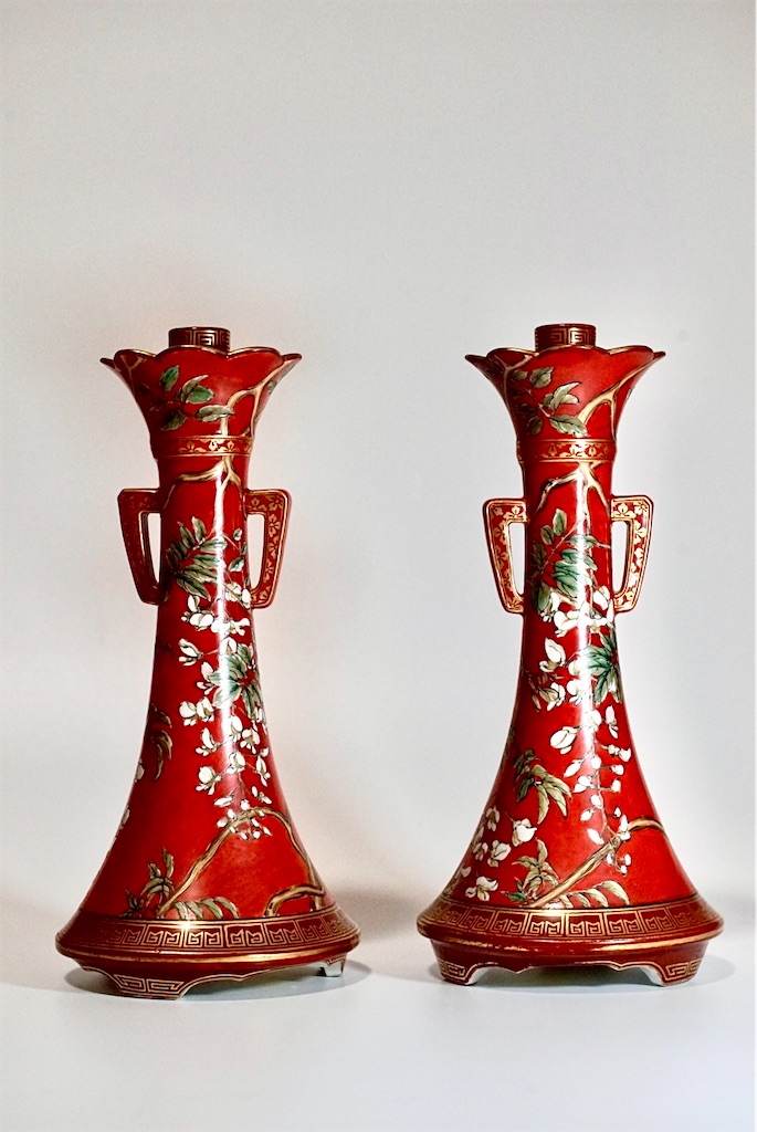
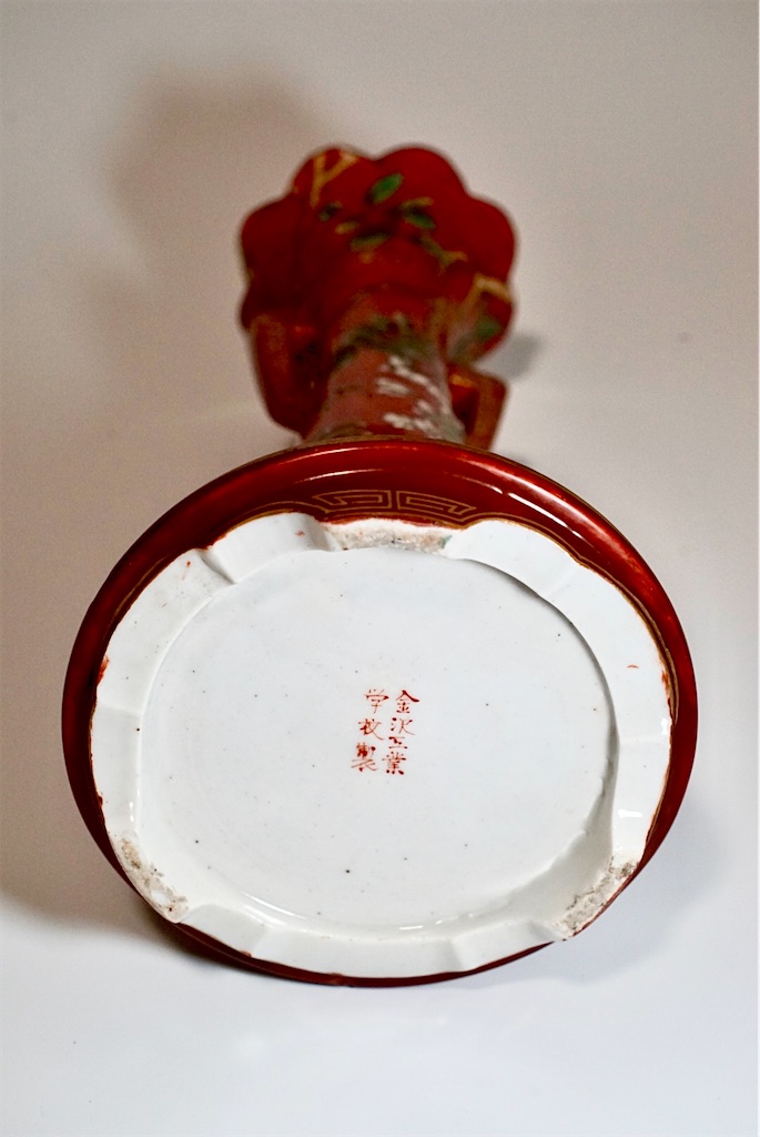
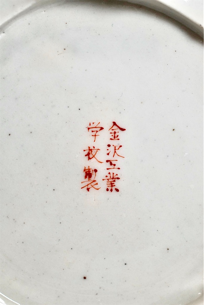
さて、今日、私のコレクションからご紹介するのは、日本で最初に設立された工芸学校、金沢工業学校(明治20年~明治22年)で制作された九谷焼の燭台です。小さな学校とは言え、先述の納富介次郎が初代校長を務め、その後に帝室技芸員となった諏訪蘇山・板谷波山や友田安清・竹内吟秋などの錚々たる人達が教員を務めました。また、既に輸出にも貢献していたところなど、産学官連携の嚆矢としての役割を果たしていたと言えましょう。当時の大日本帝国も芸術産業を殖産興業の柱としてもっと推進していれば、もう少し平和的な展開ができていたかもしれません。
![NHK 100分 de 名著 ヘーゲル『精神現象学』 2025年 3月 [雑誌] (NHKテキスト)](https://m.media-amazon.com/images/I/5130W9Qm3FL._SL500_.jpg "NHK 100分 de 名著 ヘーゲル『精神現象学』 2025年 3月 [雑誌] (NHKテキスト)")

The word “Aufheben” once briefly entered the limelight when Tokyo Governor Yuriko Koike used it in a public address. Needless to say, it is a well-known concept in Hegelian dialectics. Hegel used “Aufheben” to describe the process by which a thesis (These) and its antithesis (Antithese) are pushed to a higher level of resolution, resulting in a synthesis (Synthese).
The person who translated this German word Aufheben into Japanese as “止揚” (shiyō) was Tosihiko Sakai, a contemporary of Shūsui Kōtoku. The term “止揚” captures the dual movement of halting (止) a deadlock between competing propositions and simultaneously lifting (揚) them to a higher level. It is, in that sense, a brilliant translation.
Today, fewer people read German philosophy or Marxist texts, and regrettably, “止揚” is perhaps on the verge of extinction as a term.
Now, as usual, I have strayed far from my original topic of ceramics.
What I had been thinking was this: until about the 19th century, both in Japan and Europe, there existed—as in Akiyuki Nosaka’s song “Black Ship Ballad”—a deep, dark river not only between men and women, but also between art and craft.
Craftworks, associated with the so-called “beauty of utility,” were primarily functional; aesthetics came second. By contrast, fine art is judged first and foremost on aesthetic value, with functionality being of little or no concern.
Beautiful as they may be, Nabeshima or Hirado wares are, above all, still dishes and vessels. Paintings and sculptures, on the other hand, are evaluated for their visual beauty, with no reference to utility.
Eventually, however, interaction began between the two spheres. For instance, in the field of ceramics, artisans began to employ painters from the Kano school or Nanga (literati painting) tradition for overglaze decoration, elevating the aesthetic quality of ceramic surfaces. Conversely, the realm of fine art began to explore new dimensions—not limited to the two-dimensional (painting) or three-dimensional (sculpture) categories—by engaging with ceramics as a medium. This led to a fusion of pictorial beauty (painting on ceramics) and form beauty (shaping of the vessels themselves).
But can we say that this resulted in the true unification of “useful beauty” and “useless beauty”? Likely not. That’s because this fusion happened at the individual level, through the work of specific artists or craftsmen, not at the institutional or systemic level. There remained a divide between the worlds of art and craft.
There’s a term unfamiliar in Japan: “Arts Industriels” (industrial arts). It refers to efforts to turn art into industry. Some may frown at this, especially those who believe in art for art’s sake, perhaps objecting: “How dare you commercialize the soul of art?” But compared to the arms trade or military industry, this approach is far more peaceful and arguably in line with today’s SDGs (Sustainable Development Goals).
France was the leader in this field.
The Exposition Universelle in Paris in 1878, which Japan officially participated in, was designed as an opportunity for France to showcase its leadership in the arts. In this context, decorative arts (artistic craft) were viewed as a major industrial sector in competition with Germany and the UK.
Following this national policy, Arts Industriels emerged in France, represented by the likes of:
Sevres porcelain
Baccarat crystal
Limoges porcelain
Art Nouveau glass by Gallé and Lalique
Christofle silverware
Is this not a more elegant and admirable policy than selling weapons and promoting militarism?
Japan, too, was influenced by this movement. In fact, it would be more accurate to say France was influenced by Japanese ceramics and lacquerware in the first place. Unfortunately, since Japan did not have a tradition of integrating art into industry, it ended up learning back from France. France thus achieved what could be called “the honor of the student surpassing the teacher.”
In this sense, French Arts Industriels offer a textbook example of a successful Aufheben, or sublation, of the art world and the craft world.
Not wanting to fall behind, Japan also began establishing craft schools alongside technical schools. Leading this movement was Nodomi Kaijiro of Saga Prefecture.
Saga’s Arita, having pioneered the industrialization of ceramics through the export of Imari ware, naturally gave rise to someone like Nōtomi, who became a key figure in the founding of such institutions.
Today, I would like to introduce an item from my collection: a pair of Kutani porcelain candlesticks, made at the Kanazawa Technical School (established 1887–1889), Japan’s first craft school. Despite being a small school, it had already contributed to exports, thus serving as an early model of industry–academia–government collaboration.
Had the Empire of Japan made arts industries a pillar of its industrial development policy, perhaps its trajectory might have taken a more peaceful course.
九谷庄三の真贋 Real or Imitation? The Case of Kutani Shōza
いつもは、明治陶磁器とあまり関係のない話題に逸脱してしまいがちなのですが、今日は少し真面目に九谷庄三の作品に就いて書いてみたいと思います。
九谷焼とは、石川県の加賀地方で17世紀の江戸時代前期に始まった色絵陶磁器のことですが、厚みのある和絵具で豪胆な絵付けをされているのが特徴です。一度廃窯となりましたが、約100年の空白期間を経た後に再開されたのが再興九谷です。
江戸時代後期、加賀藩が京都から磁器職人を招き、九谷焼の生産を再開したことが再興の契機でした。春日山窯・若杉窯・小野窯・民山窯などの優れた再興九谷の窯が現れましたが、その中でも特に、豊田伝右衛門が築いた吉田屋窯は、古九谷に迫る高い芸術性と品質の五彩手(赤・黄・緑・紫・紺青)の作品を製作しました。更にその後、赤絵金彩の技術を発展させた宮本屋窯や京都の永楽和全の指導を受けた木崎窯なども現れ、再興九谷は隆盛期を迎えました。
ただ、再興九谷の個々の諸窯は、家内制手工業の枠内に留まりましたから、生産規模は産業と呼ぶには程遠い状況でした。そうした中で、九谷庄三は、小野窯で頭角を現した後、絵付けの工程だけを分業化して、庄三工房を設立しました。庄三は、上述の五彩手・赤絵金彩の手法を統合し、かつ、伝統的和絵具と当時輸入されたばかりの洋絵具の両方を駆使しながら、それまでになかった中間色を用い、また、絵付けも単純な山水画や花鳥風月だけでなく、割絵という手法で山水・花鳥・人物の全てをモチーフとして取り込みました。九谷庄三は、組織・技法・芸術性を高いレベルで統合して、まさに、芸術を産業化した魁であり、その作品は一世を風靡しました。こうして多くの庄三の作品が欧米各国に輸出されるようになりました。
従って、庄三の優品の多くは実は日本よりも欧米各国に残されているというのが実態です。これは、庄三だけに限らず、明治期の日本各地の多くの陶磁器にもあてはまります。
ところが、その独創的芸術性と日本窯業への高い貢献度に比して、日本では思いがけず、その名が知られていないのが九谷庄三であると言えるでしょう。それは何故でしょうか。
実は、昨今のオークションや日本各地の骨董店では、膨大な数の「庄三」の作品が日々売買されているのですが、実は、それらの庄三作品の99.99%は贋作です。本当の九谷庄三本人の作品、或いは、九谷庄三工房の作品が市場に現れることは、滅多にありません。
このような、出来の悪いお土産庄三や贋作庄三が九谷庄三の評価を低めているのではないかと、私は思っています。
因みに、庄三作として売買されている作品は、以下のようにカテゴライズできると思います。
① 九谷庄三本人の作品 -> 庄三銘あり
② 庄三工房の作品 -> 庄三銘あり
③ 庄三工房出身者の単独作品 -> 九谷銘のみ(庄三銘なし)
④ 庄三の高弟の作品 -> 弟子の銘(武腰・中川・笠間・中野など)
⑤ 庄三手の土産物 -> 庄三銘あり(茶器などの小品が多い)
⑥ 庄三を真似た贋作 -> 庄三銘あり(大皿などの大作が多い)
⑦ 庄三工房出身者ではない者の庄三風の作品 -> 九谷銘のみ(庄三銘なし)
このうち、⑤はあまり悪意のない土産物ですが、⑥は悪意のある贋作です。更にややこしいのが、⑦の作品に後から庄三の銘を書き加えた作品です。元は贋作ではなかったものが、悪意を持った者によって贋作にされたケースです。③に後から庄三の銘を加えたケースも理屈上ではあり得ますが、①~④のまでの作品は、実は市場には滅多に現れません。従って、オークションなどに現れる贋作の殆どは、⑤⑥⑦のいずれかということになります。
さて、それでは、真贋の見分け方がですが、先ず陶土が違います。初期の庄三の作品には地元の蕎麦色のような黒っぽい陶土が使われています。中期になると、小麦色の京薩摩のような陶土になります。後期の明治期では、磁器にちかい白い陶土になります。おそらく、庄三に素地を提供していた九谷の窯元たちは、中期では薩摩から、後期では東京横浜あたりから陶土を仕入れていたのではないかと思います。
また、絵付けも初期の作品では和絵具の比率が多く、絵具を厚く盛り上げたような表現が多いのですが、中期から後期になるにつれて洋絵具の割合が増えて、全般的にフラットで中間色の多い絵付けになったように思われます。
絵付けそのものに就いては、真作と贋作では雲泥の差があります。真作(庄三本人もしくは工房の正式な作品)の花鳥風月は葉脈の一本一本も花弁の一枚一枚も実に緻密な絵付けがされています。金彩の地文様も丁寧で緻密です。人物なども一人一人の表情が実に豊かで、笑い声や話し声が聞こえてくるようです。これ以外にも本物の特徴はいくつかありますが、庄三本人やその高弟と言われる人たちの作品を見れば、贋作との違いは一目でわかるはずです。
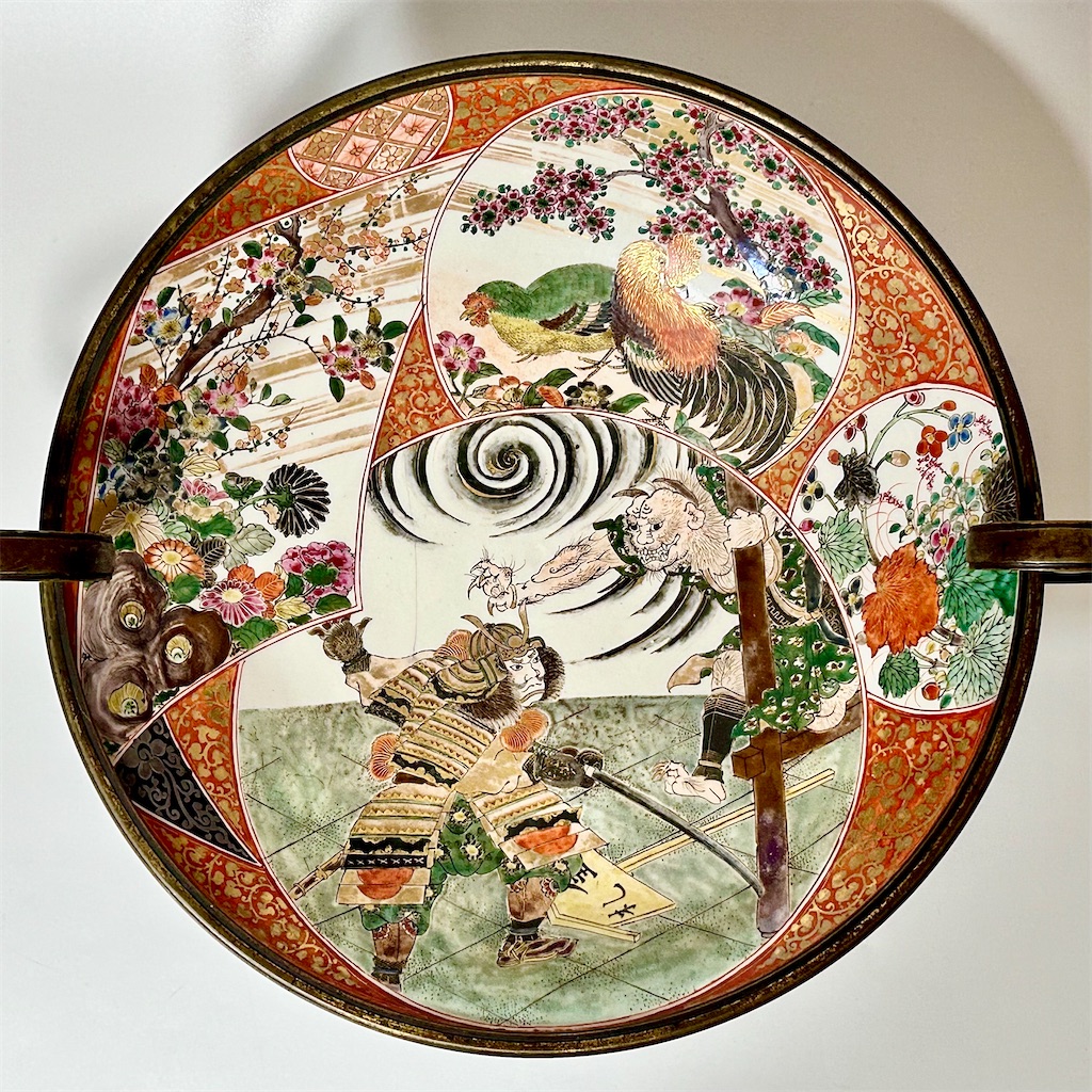
それでは、今日、私のコレクションからご紹介させていただくのは、庄三の武者絵と鬼を描いた深鉢に欧州で真鍮の飾り付けが加えられたものと花鳥を洗練された割絵構図で描いた深鉢です。いずれも、後期の秀作と言えるでしょう。
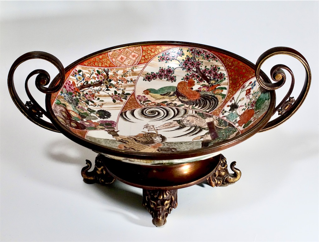
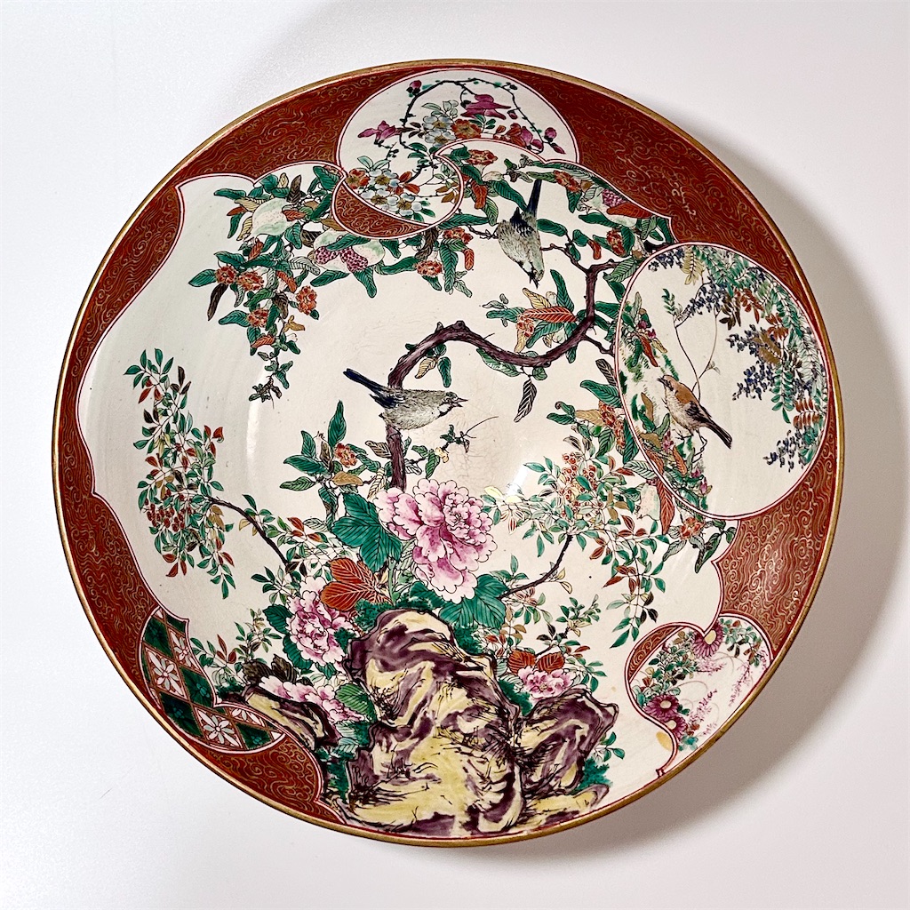
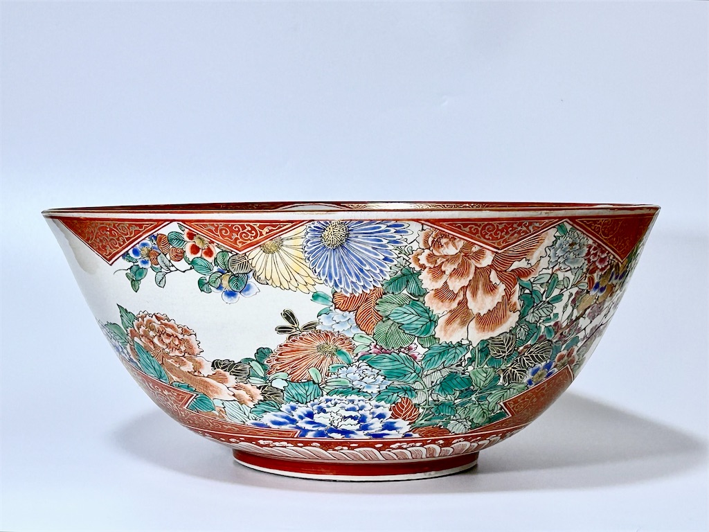
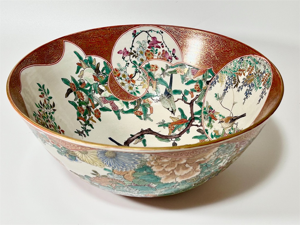


I often tend to digress into topics unrelated to Meiji-era ceramics, but today, I would like to take a more serious look at the works of Kutani Shoza.
Kutani ware refers to polychrome porcelain produced in the Kaga region of Ishikawa Prefecture, originating in the early Edo period in the 17th century. It is characterized by bold overglaze painting using thick layers of traditional Japanese pigments. The original kilns were abandoned for a time, but roughly a century later, Kutani ware was revived—this period is known as Saikō Kutani (“Revived Kutani”).
The revival began in the late Edo period when the Kaga domain invited porcelain craftsmen from Kyoto to restart production. Several excellent kilns emerged during this period, including the Kasugayama, Wakasugi, Ono, and Minzan kilns. Among them, the Yoshidaya kiln, established by Toyoda Den’emon, produced highly artistic and refined works in the five-color palette (red, yellow, green, purple, and dark blue), rivaling the quality of the original Ko-Kutani ware. Later, other kilns such as the Miyamotoya kiln, known for developing red overglaze with gold, and the Kizaki kiln, which received guidance from Kyoto’s Eiraku Wazen, also contributed to a golden age of Revived Kutani.
However, these kilns largely operated within the bounds of home-based craft production, far from the scale required to be considered a true industry. In this context, Kutani Shoza distinguished himself by establishing a workshop that systematized division of labor, focusing specifically on the painting process. Shoza merged techniques of five-color overglaze and red-and-gold decoration, skillfully using both traditional Japanese pigments and newly imported Western ones. This allowed him to create unprecedented intermediate hues. His decorative style also broke new ground by incorporating not only conventional landscapes and flower-and-bird motifs, but also a technique called “wari-e”, or “partitioned painting”, which combined scenery, flowers, birds, and human figures within a single composition.
In this way, Shoza was a pioneer who industrialized art, combining organization, technique, and artistic expression at a high level. His works became immensely popular and were widely exported to Europe and other parts of the world.
As a result, many of Shoza’s finest works are now found outside Japan, particularly in Europe and America. This phenomenon is not unique to Shoza; it applies to many other Japanese ceramics of the Meiji era.
Yet, despite his originality and significant contributions to the Japanese ceramic tradition, Kutani Shoza remains surprisingly underrecognized within Japan. Why is that?
In fact, today, a vast number of works labeled as “Shoza” are actively traded in auctions and antique shops throughout Japan. However, 99.99% of them are not genuine. Authentic works by Kutani Shoza himself or his workshop are extremely rare in the market.
I think that poorly made souvenir Shōza pieces counterfeit Shōza works are lowering the reputation of Kutani Shōza.
These so-called “Shoza” works can be categorized roughly as follows:
1. Works by Shoza himself → Signed “Shoza”
2. Works from the Shoza workshop → Signed “Shoza”
3. Works by former workshop members → Signed “Kutani” only, no “Shoza”
4. Works by Shoza’s senior disciples → Signed by the artist (e.g., Takegoshi, Nakagawa, Kasama, Nakano)
5. Souvenir-grade pieces in the Shoza style → Signed “Shoza” (often small items like tea sets)
6. Forgeries made in imitation of Shoza → Signed “Shoza” (often large items like chargers)
7. Imitative works by non-affiliated artists later falsely signed as “Shoza” → Usually signed “Kutani” only, with the “Shoza” signature added afterward
Among these, category 5 comprises mostly harmless souvenir pieces. Category 6, however, includes deliberate forgeries. Even more problematic are items in category 7 —originally not intended as fakes, but later turned into forgeries by someone maliciously adding a false “Shoza” signature. While it is also conceivable that category 3 works could have had false “Shoza” signatures added later, the fact remains that categories 1 to 4 are exceedingly rare in the current market. Therefore, the majority of “Shoza” pieces seen in auctions or antique shops today belong to categories 5, 6, or 7.
So, how can one distinguish genuine works?
First, the clay is different. In his early period, Shoza used a locally sourced, soba-colored clay—a dark, brownish-grey tone. In the mid-period, the body becomes more tan-colored, resembling that of Kyoto Satsuma ware. By the late Meiji period, the clay used is much whiter and more porcelain-like. It is likely that his kilns sourced clay from Satsuma in the mid-period and later from places like Tokyo or Yokohama.
As for the painting techniques, early works show more use of traditional Japanese pigments with thick, raised textures. From the mid to late periods, Western pigments become more prevalent, leading to flatter, more subdued color tones with more intermediate hues.
In terms of decoration, the difference between genuine and fake works is stark. Authentic pieces—either by Shoza himself or from his official workshop—exhibit incredibly fine detail. In their depictions of birds and flowers, every vein in the leaves and petal of a flower is delicately rendered. Background gold patterns are also meticulously applied. In human figures, each face is full of expression, to the extent that you can almost hear their voices and laughter.
There are other distinguishing features, but once you’ve seen genuine works by Shoza or his senior disciples, the difference between them and forgeries becomes instantly apparent.
Today, I’d like to introduce two examples from my collection:
A flat bowl featuring warriors and demons, to which a European-made brass mount has been added.
A deep bowl depicting flowers and birds in a refined wari-e composition
Both are fine examples of Shoza’s remarkable craftsmanship of his later period.
古色 Patina
古色蒼然というと非常に古くて色あせた様子という意味で、あまり良い意味がなさそうですが、骨董品の世界では、古色には悪い意味はありません。
日本の骨董品の世界などでは、「この井戸茶碗の見込みのシミが良い景色になっていますね」などと言い、ここで言う景色は古色に近い意味です。
西洋アンティークの世界などでも、”Nice patina”などと言い、良い意味に使います。
Patina(パティーナ)とは狭義には緑青のことですが、広義では古色とか風格というような意味を持ちます。
ところが、これが人間のことになりますと、「お顔のシミが良い景色になっていますね」とか、「風格のある皺ですね」とは言わず、シミや皺をありがたがることはなさそうです。
自動車も同様に、自動車のドアに浮いた錆やひっかき傷やぶつけてへこんだところなどを「いい景色ですね」とは言わないので、人間だけに限ったことではないようです。
それでは、あるものは古くなったり疵がついたりしても、「古色が出てきましたね」とか「風格がありますね」というのに、あるものでは汚いとかみっともないとされるのは、一体どういうことなのでしょうか。
おそらく、実用品とみなされるものは常に新品が良いとされるため、クラシックカーなどはいくら古くても、クロームや真鍮をピカピカに磨きあげて、塗装も新しくしないといけないのではないでしょうか。これに対して、美術品とみなされるものは、逆に手を後から加えてお化粧直しなどすると、オリジナリティがなくなると言われて敬遠されるのではないでしょうか。言い換えますと、美術品は古くなったり汚れたりしても、古色が出てきたと言われて珍重されるようです。
ただ、古い仏像の多くは過去に何度も塗り替えられたようですから、当時は祈祷や装飾のための実用品とみなされていたのだと思いますが、時代のどこかで、美術品とみなされるようになり、むしろ汚れや古さが尊いこと、ありがたいこととされるようになったということは、本来実用品だった仏像が美術品への質的転換をどこかで果たしたのではないかと思います。
骨董の陶磁器なども室町・桃山あたりの丹波焼や信楽焼などの陶器は古色を評価されるようですが、江戸時代以降の磁器などの場合は、まだ新品に近いほうが評価されるのが実態ですから、骨董陶磁器の場合は実用品から美術品への質的転換リードタイムが500年以上なのかもしれません。
私も年寄りになり、時代のどこかで実用品から美術品への質的転換を果たして、私の顔のシミや皺を「いい景色ですね」とか“Nice patina!”などと評価してもらえれば良いのですが、なかなかその気配のないのが残念です。美術品になるリードタイムが500年とすると、人間の場合、使い捨ての単なる実用品から美術品に生まれ変わるチャンスはなさそうです。
しかし、はたしてそうでしょうか。オリジナルの美術品には複製品にないオーラがあることは、ベンヤミンが「複製技術時代の芸術」で指摘している通りですから、物理的表層のレベルではなく、オーラのレベルで上手に年を取る方法はあるような気がします。
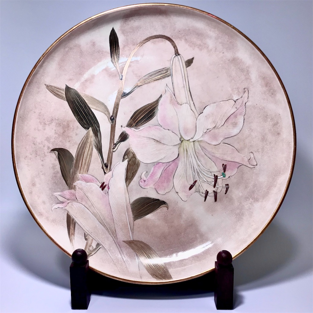
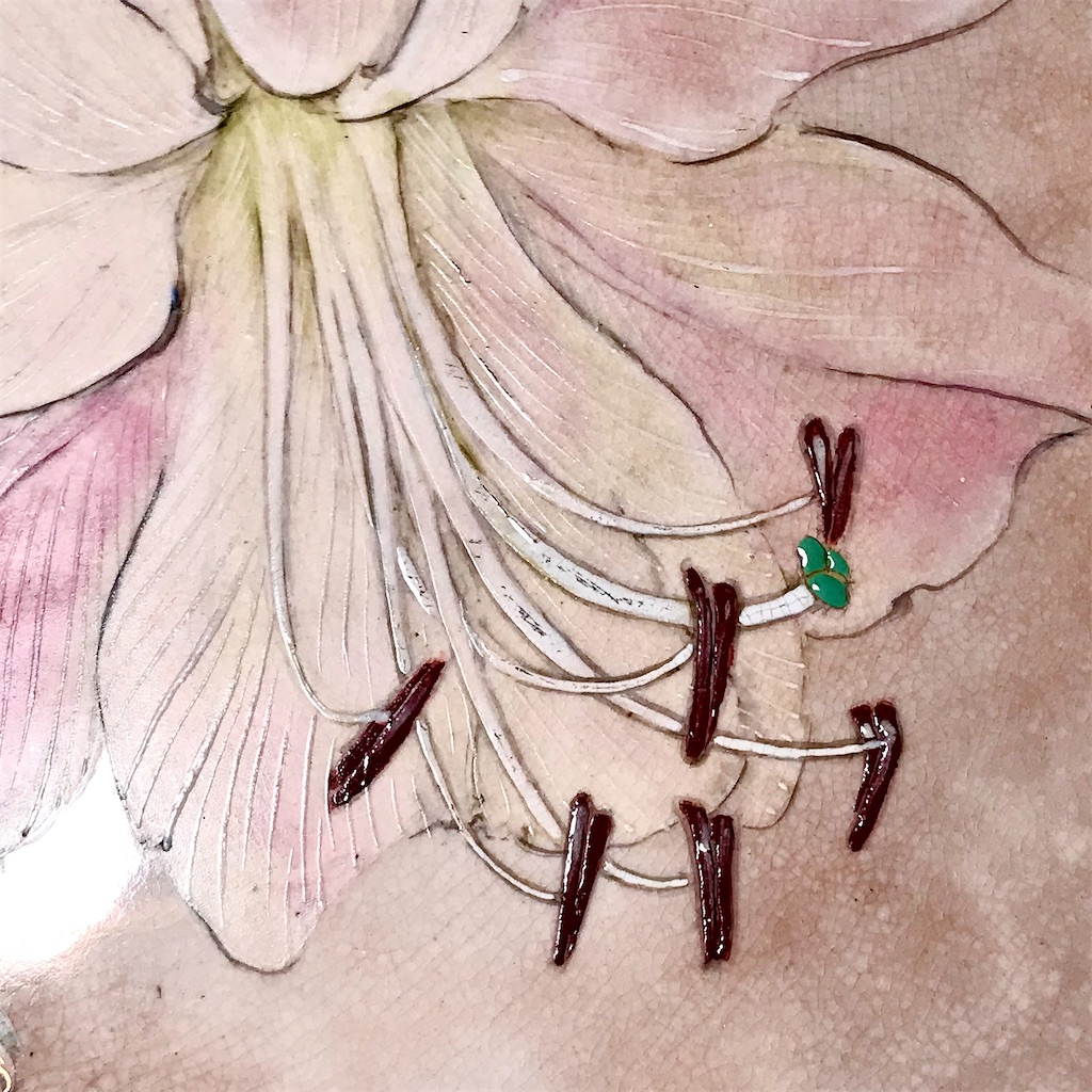
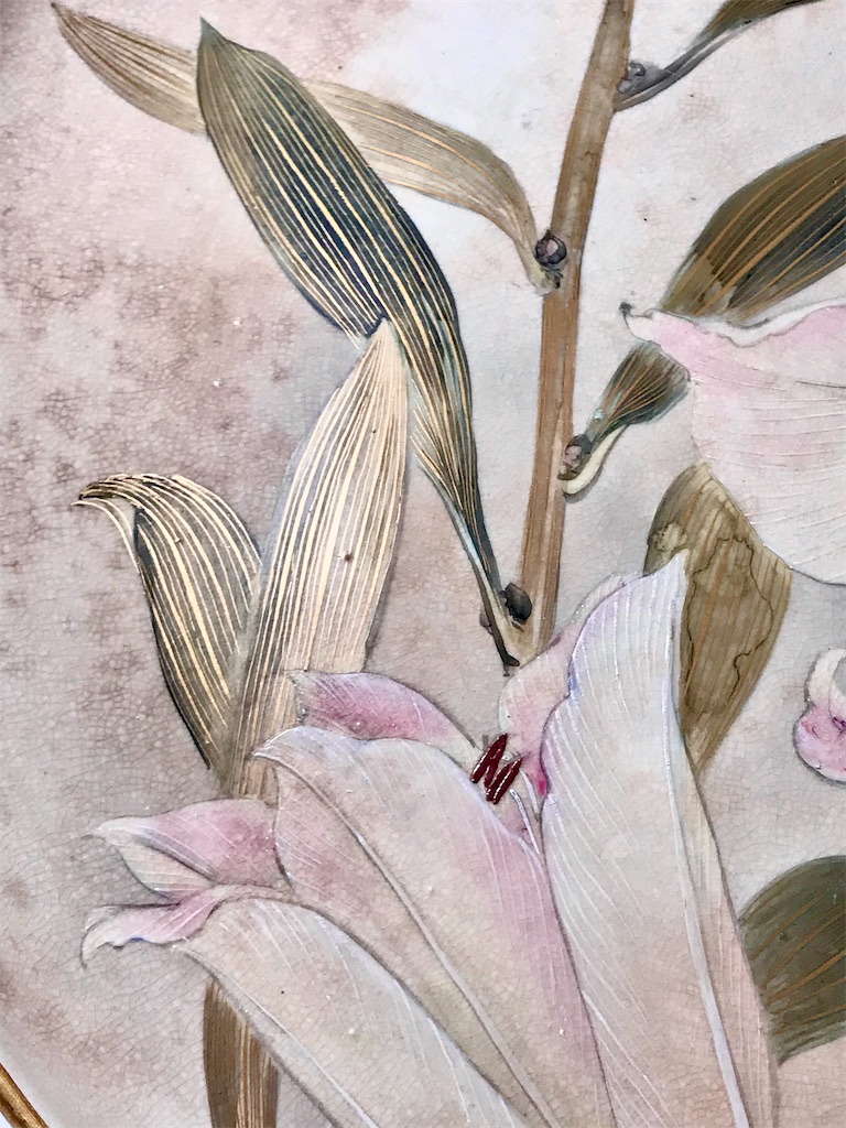
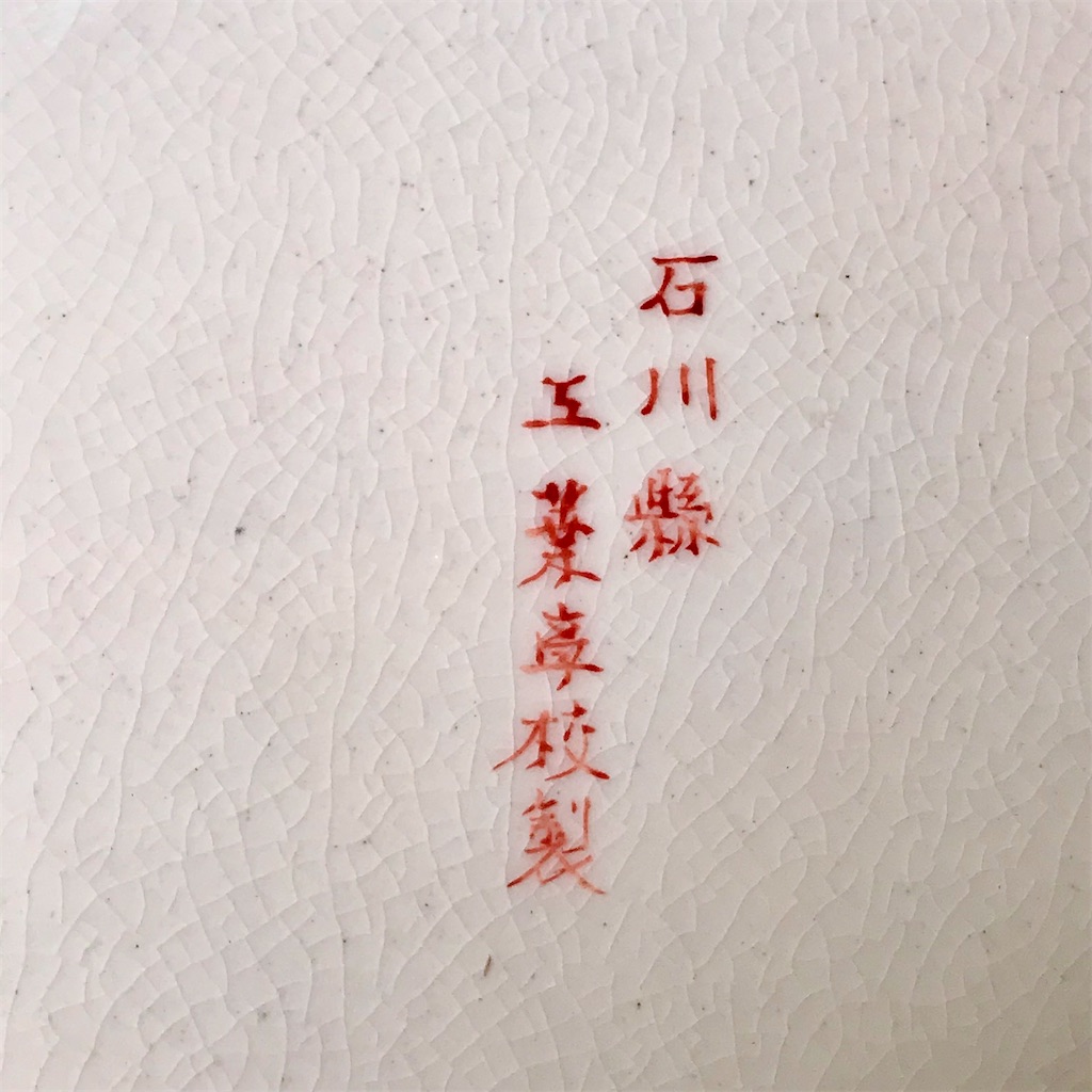
さて、今日ご紹介するのは、明治時代に石川県工業学校が作成して、アメリカに輸出した上絵百合文大皿です。石川県工業学校は、明治20年に佐賀県出身の納富介次郎が創立した工芸学校であり、当初は金沢区工業学校と呼ばれていました。石川県工業学校と呼ばれていたのは、明治22年から明治34年の期間ですから、この大皿もその期間に作られて、アメリカに輸出されたことになります。高台にはアメリカの当時の輸入許可ラベルの破片がついています。この石川県工業学校の教師には、友田安清・諏訪蘇山・北村弥一郎・竹内吟秋・板谷波山などの錚々たる工芸家・陶芸家がいましたから、学校名で造られた品物にも、これらの教師たちのいずれかによってつくられたものがあるようです。
この大皿の見込みにも経年のシミが多くありますが、これを汚れと見るか古色と見るか。私には、良いオーラを出しているように見えるのですが、如何でしょうか。


The phrase “koshoku-sōzen” (古色蒼然) typically evokes an image of something extremely old and faded, and at first glance, it may not seem like a particularly positive description. However, in the world of antiques, especially in Japan, it doesn’t carry a negative connotation.
For instance, in the world of Japanese antiques, one might say something like, “The stains on the interior of this Ido tea bowl have become a beautiful landscape (keshiki), haven’t they?” Here, the word “landscape” refers to the aged appearance, much like koshoku (the beauty of age and use).
Similarly, in the world of Western antiques, one often hears the phrase “Nice patina.” While patina in the narrow sense refers to the greenish film that forms on copper and bronze over time, more broadly, it means the character and elegance that come with age. In this sense, patina is appreciated and admired.
However, when it comes to humans, we don’t usually say things like, “The spots on your face have created a lovely landscape,” or “Your wrinkles have such dignified character.” Age spots and wrinkles are rarely appreciated in the same way. The same goes for cars — no one says that the rust on a car door, the scratches, or the dents have “developed a fine patina.” So, it’s not limited to humans.
Why, then, is it that in some cases, age and damage are appreciated as koshoku or signs of dignity, while in others, they’re simply seen as dirty or unsightly?
It likely comes down to whether something is regarded as a functional item or a work of art. With functional items — say, cars — there’s an expectation that they should always look new and pristine. Even classic cars, no matter how old, are expected to have polished chrome and brass, and fresh paint jobs. In contrast, items regarded as art are often devalued if touched up or restored, as this compromises their originality. In other words, when something is considered a work of art, its age and wear can actually enhance its value — its koshoku becomes something treasured.
Take Buddhist statues, for example. Many ancient ones were repainted multiple times throughout history. This suggests they were originally seen as functional objects, used for worship and decoration. But at some point in history, they came to be regarded as art, and the grime and signs of age began to be seen as sacred, even awe-inspiring. This means that Buddhist statues underwent a qualitative transformation — from utilitarian objects to revered works of art.
The same could be said for antique ceramics. Pottery from the Muromachi or Momoyama periods — like old Tamba or Shigaraki ware — is appreciated for its patina and age. On the other hand, porcelain from the Edo period onward is often more highly valued when it still looks nearly new. So perhaps, in the case of antique ceramics, the transformation from utilitarian object to art takes about 500 years.
As for myself, having grown old, I sometimes wish I, too, could undergo that same transformation — from functional object to revered artwork. I’d love to hear someone say, “Those spots and wrinkles on your face have become a fine landscape,” or even “Nice patina!” But alas, that doesn’t seem likely. If the lead time to becoming a work of art is indeed 500 years, we humans may never get the chance to make that shift in our own lifetimes.
Still, as Walter Benjamin pointed out in “The Work of Art in the Age of Mechanical Reproduction,” true works of art have an aura — a quality that reproductions lack. So perhaps there is such a thing as aging gracefully, in a way that gives off a good aura.
Now then, the item I’d like to introduce today is a large overglaze dish with a lily design, made in the Meiji era by the Ishikawa Technical School and exported to the United States. The school was founded in 1887 (Meiji 20) by Nōdomi Kaijiro, originally from Saga Prefecture, and was first called the Kanazawa Ward Technical School. It used the name Ishikawa Technical School between Meiji 22 and Meiji 34 (1889–1901), so this dish was likely made during that period and exported to America. A fragment of the original U.S. import label still remains on the foot ring of the dish.
The Ishikawa Technical School had many prominent artisans and ceramicists on its faculty, including Tomoda Ansei, Suwa Sōzan, Kitamura Yaichirō, Takeuchi Ginshū, and Itaya Hazan. It’s said that works produced under the school’s name were sometimes created by these masters themselves.
This large dish has numerous stains in the well of the plate from aging. Whether one sees these as dirt or as a beautiful koshoku — the judgment is still up for debate.
小津安二郎の「戸田家の兄妹」 "The Brothers and Sisters of the Toda Family" by Ozu Yasujiro
「戸田家の兄妹」は、太平洋戦争が始まった昭和16年に製作されましたが、太平洋戦争の始まる12月8日の約半年前の5月18日に封切られましたから、まだ、何となく戦前の余裕のようなものが映画の内容に感じられます。
戸田家の父が亡くなった後、父が実は莫大な借財を抱えていたことが判明し、豪華な洋館はおろか父が蒐集していた書画骨董品も競売にかけられることになりました。その遺品目録の一部を長男が読み上げる場面があります。沈南蘋の秋景花鳥・円山応挙の李白観曝・酒井抱一の扇面富士・尾形光琳の扇面雪松・色鍋島水仙絵皿などの美術館収蔵品クラスの銘品の名前が次々と挙げられます。一般人がとても手にすることはないような品々です。大きな洋館には武士の甲冑類もあちらこちらに飾られています。
さて、即売会の当日の会場には、いくつかの陶磁器類も置かれています。利休好み長次郎のムキ栗と見まがうような楽茶碗もあります。清時代の鳳尾尊の花瓶もあります。その中に辰砂釉の耳付花瓶一対がありました。白黒映画ですから、辰砂の赤色かどうかはわからないのですが、花瓶の形状や白黒の階調から、清の康熙帝時代に景徳鎮で焼かれた赤い辰砂釉磁器ではないかと思われました。
辰砂釉磁器は、サン・ド・ブフ釉薬磁器とも言われます。フランス語のsang de boeuf、即ち、「牛の血」の意です。英語の骨董用語では文字通り、oxbloodとも呼ばれています。
窯変を起こす単色釉のflambe釉磁器の一種です。窯変というくらいですから、思うような発色にすることは至難の業と言われ、窯変磁器の優品は珍重されました。
さて、今日、私のコレクションからご紹介するのは、初代真葛香山の辰砂釉染付釉下彩鳳凰図花瓶です。辰砂釉を全体にかけ、胴部前後には染付の雲を背景にして、黄土色の釉下彩で鳳凰が描かれています。初代香山は、染付・上絵はもちろん、窯変・立体造形・釉下彩といった、ありとあらゆる技法を駆使した様々な作風で有名です。
本作も素晴らしい作品ではありますが、戸田家の主の蒐集品が競売にかけられるのを見てしまうと、他人によって売られてしまうくらいなら、自分の蒐集品は全て自分自身で売ってしまう方が良いのではないかと思う今日この頃ではあります。



“The Brothers and Sisters of the Toda Family” was produced in 1941, the same year the Pacific War began, but it was released on May 18, a full six months before the war officially broke out on December 8. Because of this timing, the film still retains a certain atmosphere of prewar calm and composure, which can be felt throughout its content.
After the death of the Toda family’s patriarch, it is revealed that he had, in fact, accumulated enormous debts. As a result, not only does the family lose their grand Western-style mansion, but even his carefully collected art and antiques must be put up for auction. There’s a memorable scene where the eldest son reads aloud from an inventory of these items. The list includes names like Sakai Hōitsu, Maruyama Ōkyo, Ogata Kōrin, and Iro-Nabeshima ware—masterpieces worthy of museum collections. These are far beyond the reach of an ordinary person. The grand house is also adorned with samurai armor displayed throughout.
On the day of the estate sale, several ceramics are on display. Among them is a raku tea bowl resembling the Mukiguri style favored by Rikyū, and a Qing dynasty vase marked with the Fengwei zun (Phoenix Tail Vase) shape. One particular pair of vases stood out—oxblood-glazed vases with handles, known in Japanese as shinsha-yū. Since the film is in black and white, it’s difficult to confirm the red hue, but based on the shape and tonal gradation in grayscale, one can surmise they are likely Kangxi-period copper red vases from Jingdezhen, produced during the Qing dynasty.
These shinsha-yū wares are also known as sang de boeuf in French, meaning “ox blood.” In English antiques terminology, they’re quite literally referred to as oxblood glaze. They belong to a category of flambé glazes (窯変, yōhen)—single-color glazes that undergo unpredictable transformations in the kiln. As the term “kiln transformation” suggests, achieving the desired coloration is notoriously difficult, and successful examples of these glazes are highly prized.
Now, allow me to introduce a piece from my own collection: a vase decorated with phoenixes under the glaze, made by the first-generation Makuzu Kōzan (Miyagawa Kōzan I). The entire vase is covered in a deep oxblood glaze, with clouds in cobalt blue underglaze on the front and back, set behind yellow-ochre phoenixes painted in underglaze colors. Makuzu Kōzan was renowned for his versatility, mastering not only underglaze and overglaze painting, but also kiln transformations, sculptural forms, and every ceramic technique imaginable.
Although this vase is a wonderful work in its own right, watching the Toda family’s treasured collection being sold off to strangers in the film made me reflect: perhaps, if my collection were ever to meet such a fate, I’d rather sell the pieces myself while I still can.
小津安二郎の「晩春」 Late Spring by Ozu Yasujiro
最近、遅まきながら、小津安二郎の映画をいくつか見ているのですが、その中の昭和24年の作品「晩春」を見ていて気付いたことがあります。
「晩春」は、小津映画の定番ともいえる寡夫の父と未婚の娘との間の心の揺れを主題にしています。映画の最後の方で、笠智衆演ずる父と原節子演ずる娘が京都へ最後の親子水入らずの旅行に出かけます。並べられた布団に二人がそれぞれ横になって寝る京都の旅館部屋は明かりを消され、障子には月影が落ちています。床の間には花瓶が置かれ、月光の描くシルエットから鳳尾尊の花瓶とわかります。逆光になっているため、正確にはわかりませんが、器形と僅かに見える文様から、明もしくは清時代の中国磁器とわかります。
鳳尾尊は、殷周時代の銅製酒器の觚を起源として、元明時代から花を生けるための花觚に発展しました。鳳尾尊の全体的形状は、喇叭のように開いた口を持ち、首は直立して高く、胴部は丸く膨らみ、底部は平らで外側に広がっています。底の部分には二段になった高台が多く見られ、胴の下部から脚にかけて外へ広がる姿が鳳凰の尾のように見えることから、鳳尾尊の名がつきました。特に康熙年間の鳳尾尊は華麗で気品があります。
「晩春」の床の間の花瓶は、そのシルエットだけしかわかりませんが、尾を閉じた鳳凰の立ち姿を思わせ、嫁ぐ前の娘(原節子)との間にアナロジーを感じてしまうのは私だけでしょうか。蓮実重彦によれば、この花瓶は娘の隣の寝床で眠る父の横顔のシルエットとのアナロジーですが、いずれにしても、京都の旅館の寝室に映るいくつもの光や影やシルエットが様々な隠喩を可能にしており、ポール・シュレーダーやドナルド・リチーなどが、このシーンに就いて、あらぬ方向に解釈を膨らませてしまったのも宜なるかなという気がします。
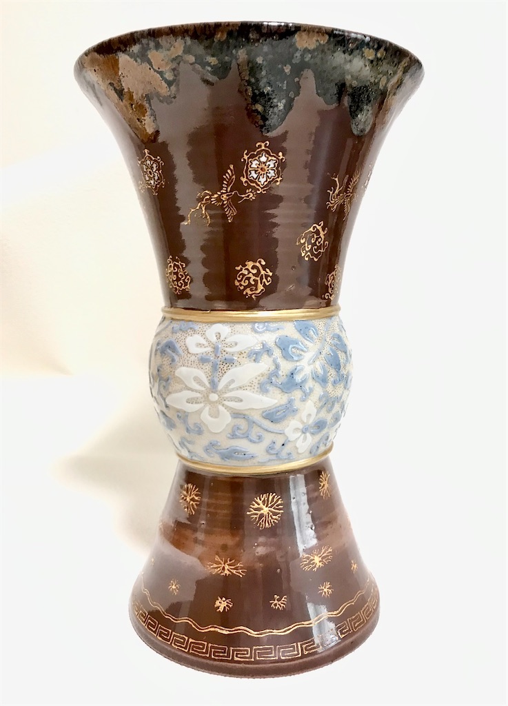
さて、今日、私のコレクションからご紹介するのは、二代井上良斎が作成した鳳尾尊の花瓶です。二代井上良斎は、パリ万博に出品参加した後、フランスの国立セーブル製陶研究所に数年残って、最新の製陶技術を学びました。しかし、帰国直後に病に倒れてしまい、惜しくも60歳の若さで亡くなってしまいました。日本窯業史における知られざる巨匠と言えます、
ご紹介する花瓶には、隅田焼時代から井上良斎が得意としたかけ流し釉が施されています。
上下は陶器のようですが、中央部は磁器で作成されているようです。飴釉の部分に金彩で描かれているのは鳳凰であり、鳳尾尊の器形と関連させたものと思います。
一見すると銅器のような仕上げとなっており、井上良斎は製作にあたって、殷周時代の尊を意識していたのではないかと想像してしまいます。


Recently, albeit belatedly, I’ve been watching some of Yasujiro Ozu’s films, and while viewing Late Spring (1949), I noticed something interesting. As with many of Ozu’s classics, Late Spring centers on the emotional tension between a widowed father and his unmarried daughter. Near the end of the film, the father, played by Chishū Ryū, and the daughter, played by Setsuko Hara, take a final, intimate trip together to Kyoto. In their inn room, where two futons are laid out side by side, the lights go out and moonlight casts shadows on the shoji screen. On the tokonoma (alcove), a vase is placed, and from the silhouette projected by the moonlight, it can be identified as a fengweizun (鳳尾尊) vase. Though backlit and not clearly visible, the shape and faint decorative hints suggest it is a Chinese porcelain piece from the Ming or Qing dynasty.
The fengweizun evolved from the bronze ritual vessel known as a gu from the Shang and Zhou dynasties, and developed into the huagu (花觚) flower vase type in the Yuan and Ming periods. The general shape of the fengweizun features a trumpet-like flared mouth, a tall, straight neck, a rounded belly, and a flat base that flares outward. Its foot often consists of two tiered rings. The form is named fengweizun, or “phoenix-tail zun,” because the flaring from the lower body to the base resembles the spreading tail feathers of a phoenix. Those from the Kangxi period of the Qing dynasty, in particular, are known for their opulent and elegant beauty.
In Late Spring, the vase in the tokonoma, though only a silhouette, suggests the upright form of a phoenix with closed wings, which might evoke an analogy with the daughter (Setsuko Hara) who is on the verge of marriage. According to film scholar Shigehiko Hasumi, the vase mirrors the silhouette of the father’s face as he lies next to his daughter in the darkened room. In either case, the play of light, shadow, and silhouette in this Kyoto inn scene invites multiple layers of metaphor. It’s understandable that critics like Paul Schrader and Donald Richie may have taken interpretive liberties with it.
Today, I’d like to introduce a fengweizun vase from my collection, made by Inoue Ryosai II. After exhibiting at the Paris Exposition, Ryosai II stayed on for several years at the National Sèvres Ceramics Research Institute in France, studying the latest ceramic techniques. Unfortunately, soon after returning to Japan, he fell ill and tragically passed away at the age of just 60. He remains a largely unrecognized master in the history of Japanese ceramics.
The vase I’m introducing is adorned with a kakenagashi-yū (流し釉) or flowing glaze, a signature technique of Ryosai dating back to his Sumida ware period. The upper and lower sections appear to be earthenware, while the central portion seems to be porcelain. A phoenix is depicted in gold over an amber glaze, a motif clearly tied to the fengweizun form of the vase.
At first glance, it resembles a bronze vessel, suggesting that Ryosai may have been consciously evoking the ancient zun bronzes of the Shang and Zhou periods during its creation.
